
Interior Aesthetics Explained: How to Balance Color, Texture, and Materials in a Space
Why does interior aesthetics matter beyond decoration?
Interior aesthetics shapes comfort, function, and perception at the same time. A room may look expensive, yet still feel cold, cluttered, or tiring.
That usually happens when color, texture, and materials are chosen separately. Good interior aesthetics comes from how those elements support one another in real use.
In practical terms, a balanced space feels visually calm, easy to maintain, and suited to daily routines. This is true in living rooms, kitchens, bathrooms, and compact apartments.
It also explains why design decisions now connect more closely with material performance. Surfaces are judged not only by beauty, but by hygiene, durability, and environmental impact.
That broader view appears often in GIAM’s reporting on building materials, sanitary spaces, and smart kitchen and bath systems. The message is simple: aesthetics works best when intelligence and construction logic meet.
When people talk about interior aesthetics, what are they really referring to?
Most people are not asking about style labels alone. They usually want to know why one space feels harmonious while another feels slightly off.
Interior aesthetics is the visual and sensory balance of a room. It includes color relationships, material character, texture contrast, proportion, light reflection, and spatial rhythm.
Color controls mood first. Texture adds depth and touch. Materials define performance, authenticity, and long-term character. If one of these dominates too strongly, balance becomes harder to achieve.
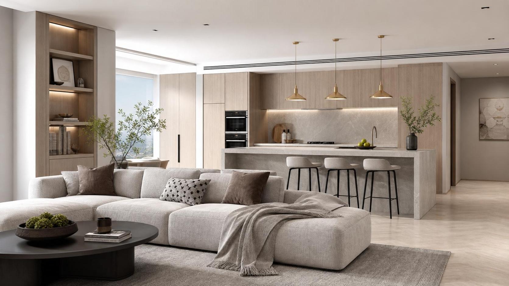
For example, an all-neutral room can still feel rich if it mixes matte stone, warm wood grain, woven fabric, and brushed metal. Without texture, the same palette may feel flat.
On the other hand, too many finishes in one room often creates noise. More common mistakes include pairing warm woods with overly cool flooring, or combining glossy surfaces without any softening element.
A useful way to read interior aesthetics is to ask three questions: what sets the mood, what adds comfort, and what must perform well over time?
A quick reference for balanced choices
The table below helps translate design intent into practical decisions. It works especially well when planning a refresh instead of a full renovation.
How do you balance color without making a room feel flat or chaotic?
Color is often the first thing people notice, but it should not work alone. The best interior aesthetics usually begins with a controlled palette, then gains interest through texture and material depth.
A common approach is to build around one dominant tone, one supporting tone, and one accent. That does not mean strict formulas. It means creating hierarchy.
In small spaces, lighter mid-tones often help walls, cabinetry, or flooring connect more smoothly. Dark accents can still work, especially in hardware, lighting, or a single statement piece.
In larger rooms, contrast can be stronger, but transitions still matter. A dramatic wall color feels more grounded when echoed in fabric, stone veining, or wood undertones.
- Choose undertones first, not just color names.
- Test paint beside flooring and major surfaces.
- Watch how daylight changes the palette.
- Use repeated accents to create rhythm.
One overlooked point is that surface finish changes color perception. A matte olive wall feels softer than a glossy one. The same white can look warmer on plaster than on polished tile.
That is why interior aesthetics should be judged in samples, not only on screens. Digital inspiration helps, but real materials reveal the true relationship between hue and finish.
Texture or material: which one has more influence on the final look?
They are closely connected, but they do different jobs. Texture shapes sensory richness, while materials carry both visual identity and performance expectations.
If a room already has a calm palette, texture often becomes the main source of interest. Think boucle seating, ribbed glass, brushed brass, natural oak, or textured porcelain.
Material choice becomes more important in kitchens and bathrooms. There, interior aesthetics must share space with moisture resistance, stain behavior, cleaning needs, and safety.
This is where GIAM’s material-focused perspective becomes useful. The portal often connects beauty with technical reality, including anti-bacterial surfaces, water-saving systems, and smart fixtures.
That kind of insight matters because a beautiful finish that scratches easily or traps moisture may look right on day one and disappoint later.
A practical rule is to mix textures generously, but choose core materials carefully. Texture can be updated with textiles and accessories. Structural materials are harder and costlier to replace.
Where this matters most
- Bathrooms need slip resistance, water tolerance, and a calm visual language.
- Kitchens benefit from durable counters, easy-clean backsplashes, and balanced contrast.
- Bedrooms respond well to tactile layers and softer light reflection.
- Living rooms can handle broader mixing, but still need one unifying material story.
What mistakes usually weaken interior aesthetics in real homes?
The most common mistake is chasing individual pieces instead of building a complete visual system. A beautiful sofa, tile, or tap cannot rescue a room with no overall logic.
Another issue is copying showroom looks without adapting them to light, layout, and maintenance habits. What works in a staged display may not work in a busy household.
Overmatching is also a problem. When everything comes from one finish family, interior aesthetics may look neat but lifeless. Some contrast is necessary.
At the opposite extreme, too much contrast can fragment the room. Five statement materials in one compact area usually compete rather than complement.
There is also a timing issue. People often finalize wall color before confirming flooring, countertops, or large furniture. In practice, permanent surfaces should guide the sequence.
- Do not judge samples under store lighting only.
- Do not ignore cleaning, humidity, and wear.
- Do not mix warm and cool undertones unintentionally.
- Do not treat smart fixtures as separate from design language.
That last point matters more today. Smart locks, touchless fittings, and water-saving systems influence the visual feel of a space, not just its function.
How can you make better decisions before buying materials or starting a redesign?
Start by defining the emotional goal of the room. Calm, warm, crisp, grounded, and airy all suggest different choices in color, texture, and materials.
Then identify the surfaces that carry the most visual weight. Usually these are flooring, walls, cabinetry, counters, and large upholstered pieces.
Once those are clear, supporting elements become easier to judge. Lighting, metal finishes, textiles, and accessories should reinforce the main direction, not compete with it.
It also helps to compare options through both aesthetics and performance. GIAM regularly highlights how evolving standards, sustainable materials, and smart systems affect everyday spaces.
That perspective is useful because good interior aesthetics is not only about style confidence. It is also about choosing solutions that age well, support health, and fit future maintenance needs.
Before moving ahead, gather finish samples in one place and view them together. If they still feel balanced in morning, afternoon, and evening light, the scheme is usually strong.
A simple decision checklist
- Name the mood you want before choosing colors.
- Limit major materials to a clear visual family.
- Use texture to add richness without adding clutter.
- Check durability for wet, high-touch, or high-traffic areas.
- Review smart and sustainable features as part of the design.
So what does a well-balanced space actually look like in the end?
It looks coherent without feeling rigid. You can notice variation, but nothing appears random. Materials relate to each other, colors feel intentional, and textures soften the overall composition.
More importantly, the space supports daily use. The room is easy to live in, not just easy to photograph. That is the clearest sign of successful interior aesthetics.
If you are planning changes, begin with the fixed elements, test real samples, and evaluate performance alongside appearance. That step usually prevents the most expensive mistakes.
A thoughtful result rarely comes from one dramatic choice. It comes from many small decisions lining up well across color, texture, materials, and function.
The next move is practical: define the room’s purpose, compare your main finishes together, and build a simple selection standard before any purchase is finalized.
Industry Briefing
Get the top 5 industry headlines delivered to your inbox every morning.